Bytown Cover Alternatives: Choose One
I like the cover to Bytown, but it was mostly created as an ambiguous placeholder to keep people from knowing what happened at the very start of Episode 1. Now that things are rolling, I'm exploring options for an alternative cover I could use for the print edition of Volume I (if/when that ever happens).
Here are a selection of options I've been working on recently. Take a look, see what strikes you as "good" and let me know which way the wind's a-blowin'.
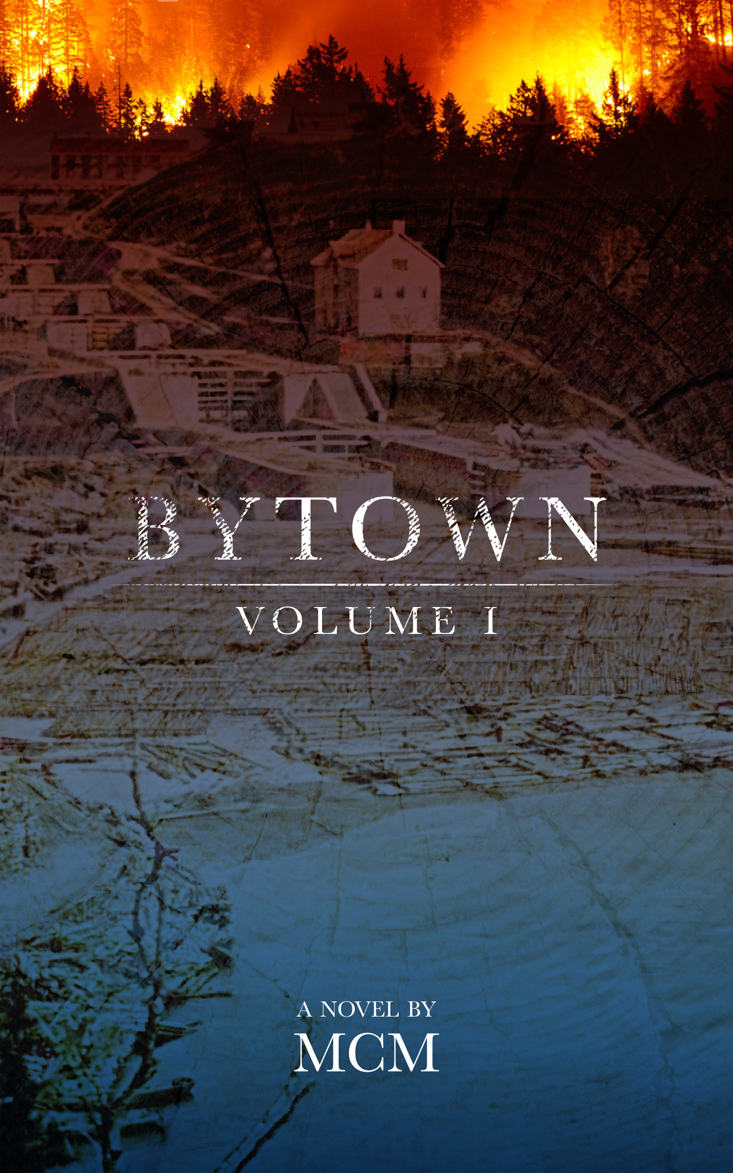
Historical
This one uses an actual oldschool image of Ottawa from near the time of the story, and merges with some dramatic fire phoros to make something that's not quite real, but not quite dry.
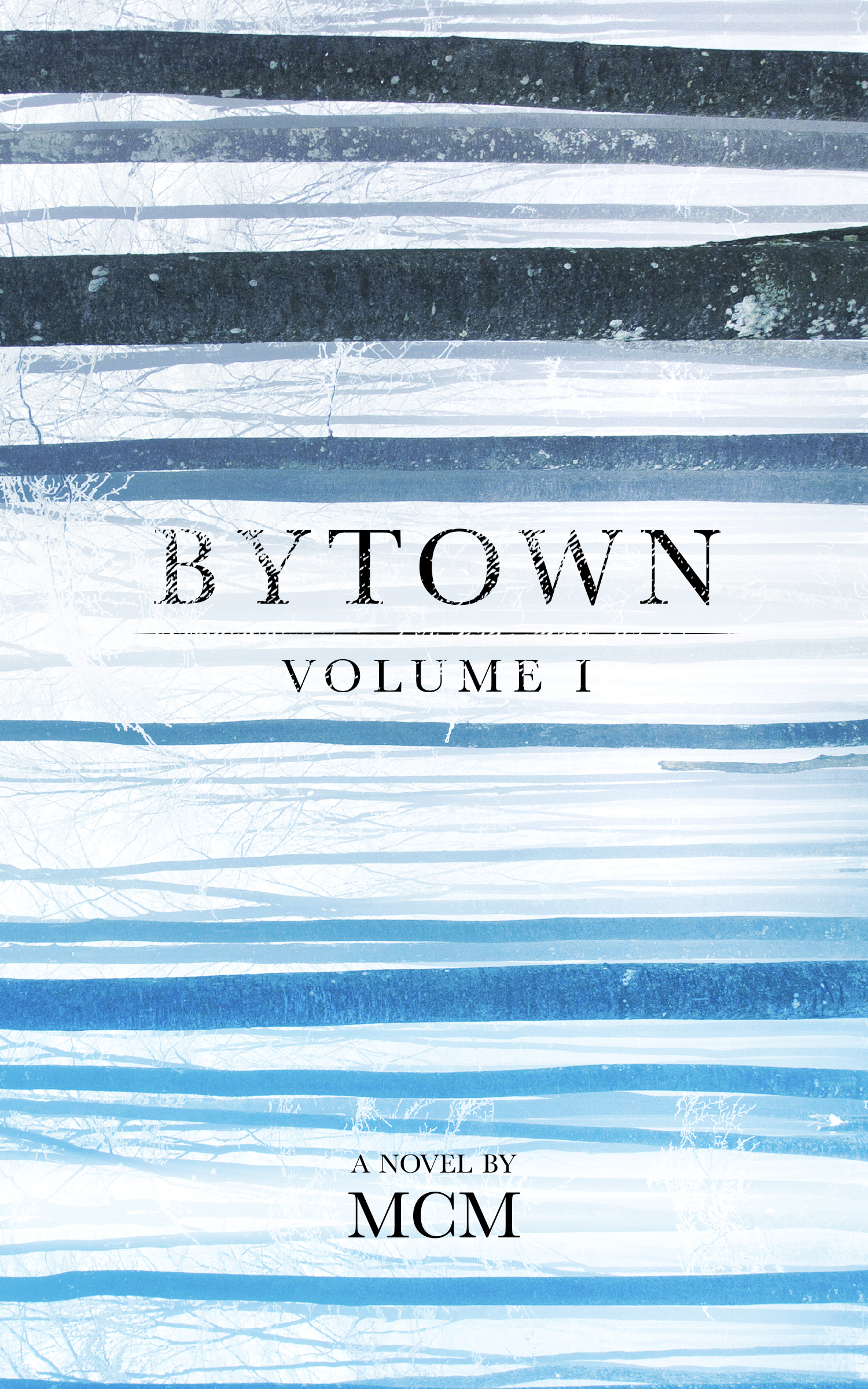
Abstract
I like this one mostly because it uses wintry trees sideways with a colour palette that I actually barely manipulated. It doesn't say a damn thing about the series, but it's pretty.
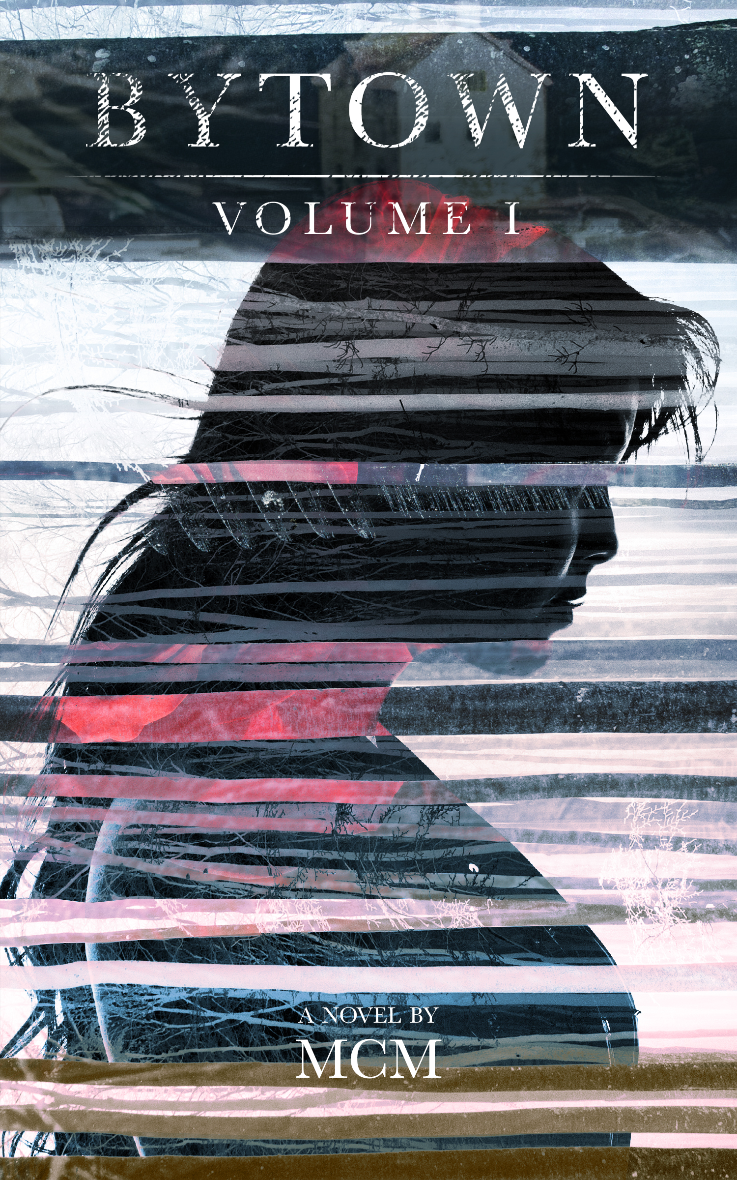
Abstract + Maggie
This one takes those trees and uses them as a negative mask, along with some other images (smoke and a knife) overlaid over an image of something who might very well be Maggie. To me, this feels like the cover to a graphic novel, which is probably not a good idea, but whatevs, it's pretty.
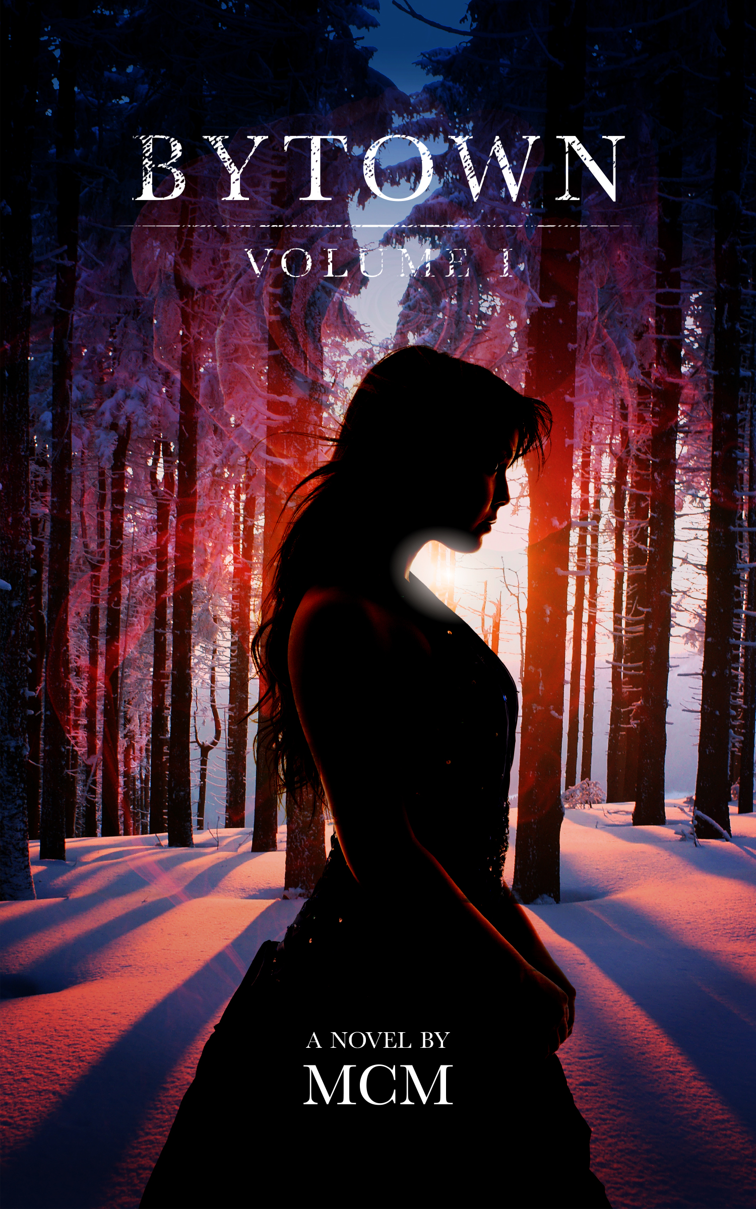
Maggie and the Sunset
Same Maggie, dramatic lighting. I like the forest in this image,and although I kinda amplified the colour contrast, it's not too far off the original. Maggie standing alone in the snowy hellscape feels pretty nice to me, though it may feel a bit too much like a YA novel (and/or romance)?
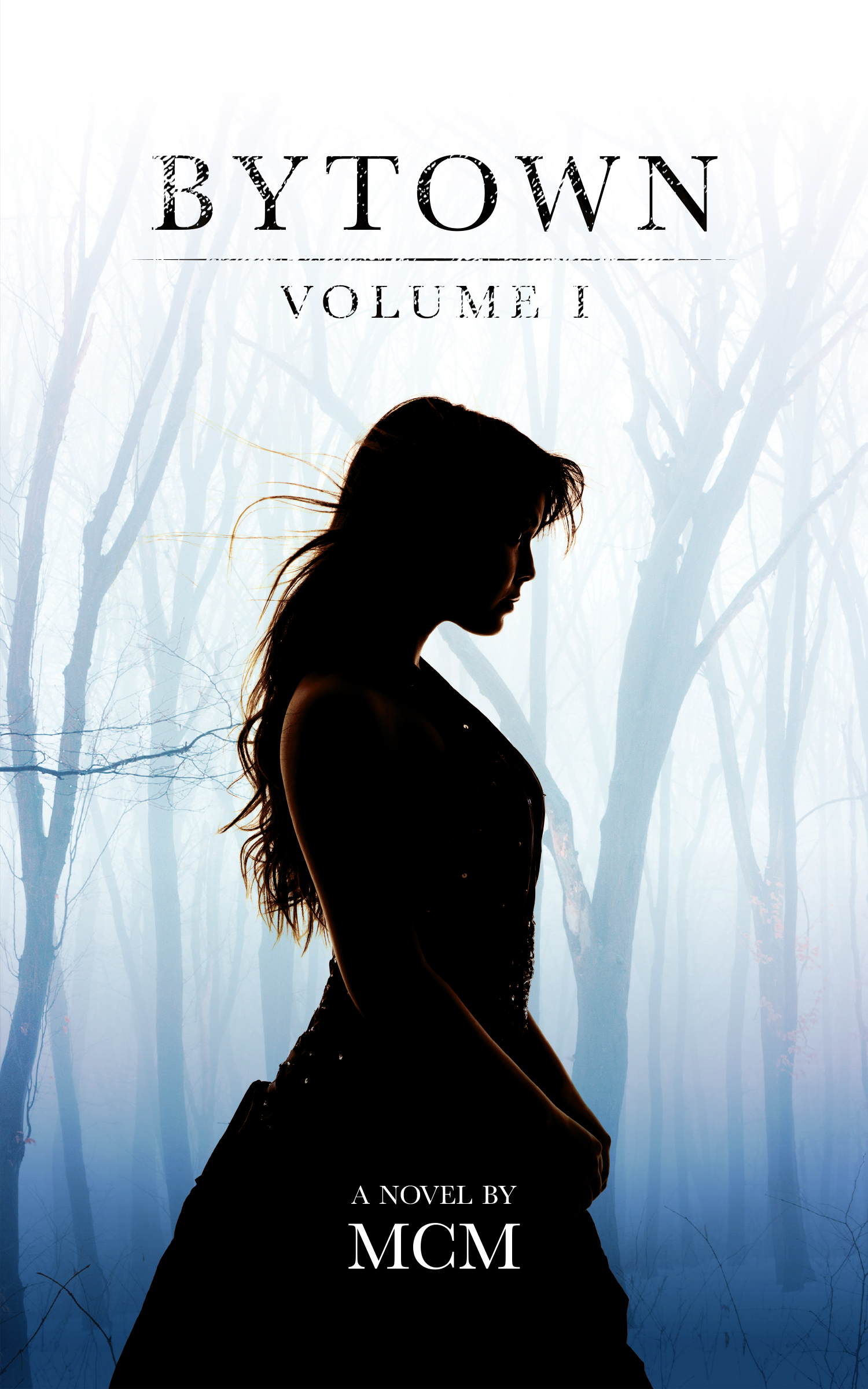
Solo Maggie
Same as before, but this time with a stark wintry background instead of a happy romantic feel. I like the simplicity of this one, though I worry that Maggie is cold with her exposed arms and all :)
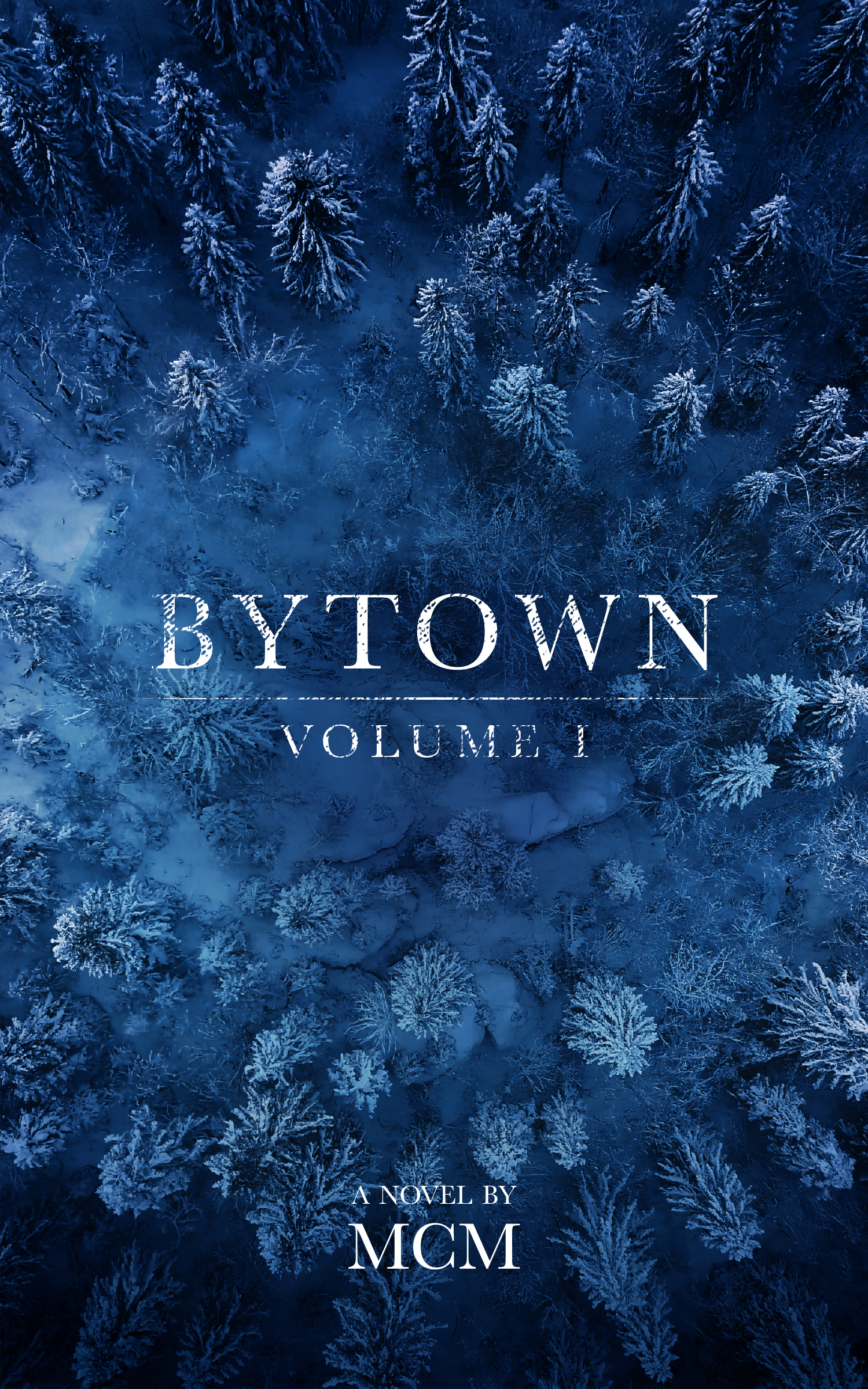
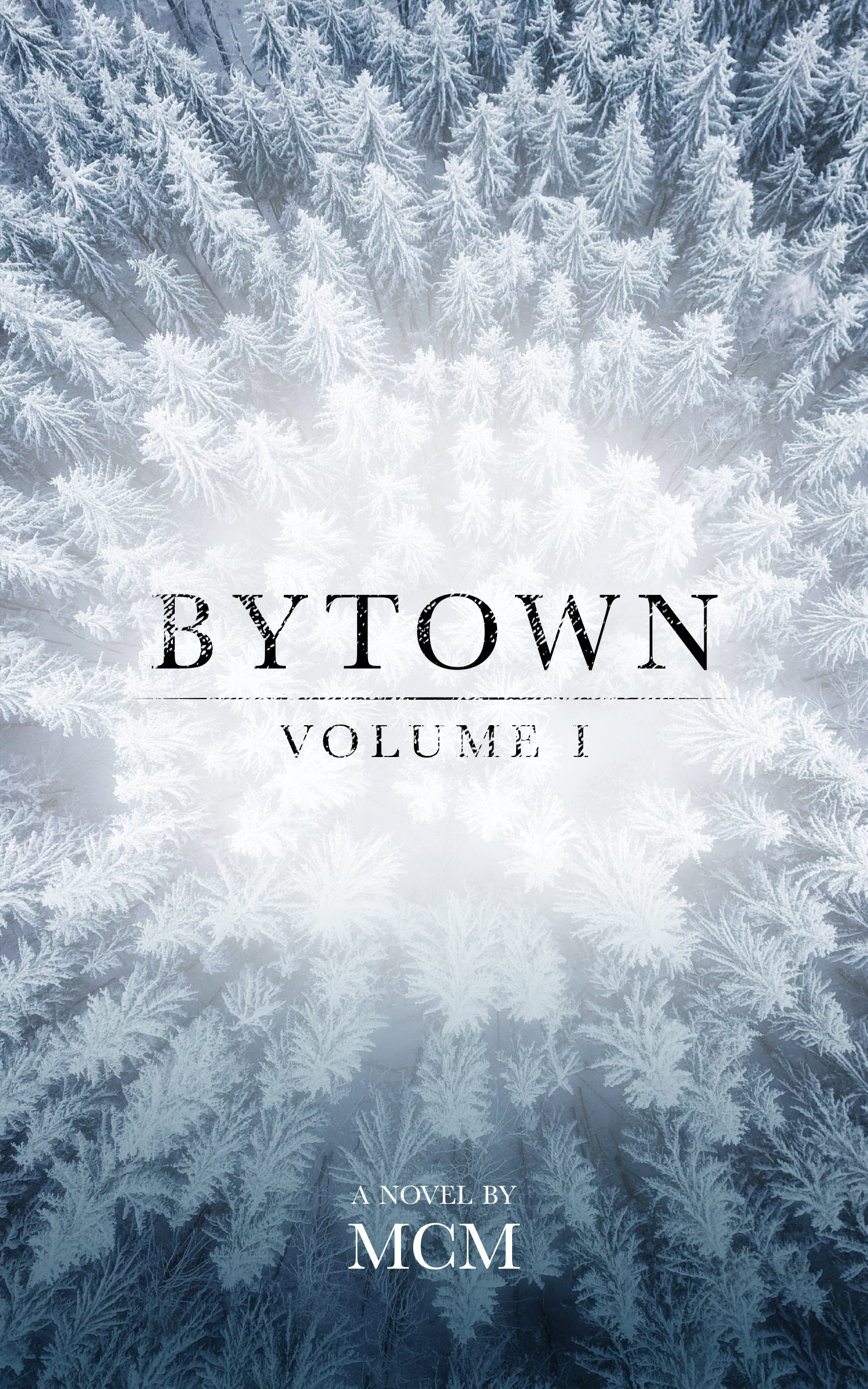
Tree Shots
And if people aren't your thing, how about these two similar shots of a winter forest from above? It's nondescript but impactful, I think. I'm just not sure it's selling the series so much as looking pretty.
